wordpress 是一種使用 php 語言和 mysql 數據庫開發的開源、免費的 blog(博客,網志)引擎,用戶可以在支持 php 和 mysql 數據庫的服務器上建立自己的 blog。今天我們來用photoshop模擬制作高光半透明的logo標志。
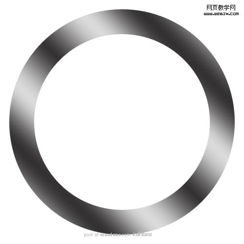
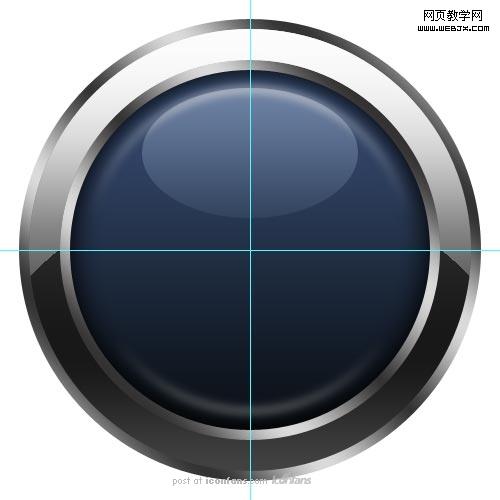
最終效果:

第一步:
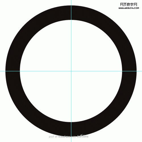
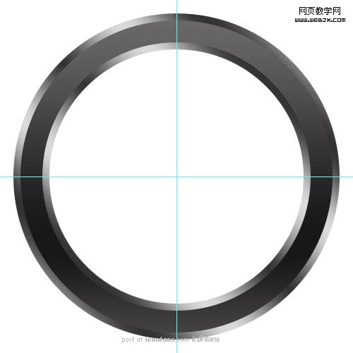
before i start pretty much any photoshop project, i drop a couple of guides on the canvas. a quick way to add two guides centered vertically and horizontally is to: create a new layer, fill it with a color [alt+backspace], enter into free transform mode [ctrl+t], then drag the guides to the center and they will snap into place. i then usually discard the layer.
在我開始任何ps項目前,我會畫一些輔助線。有一個快捷方法幫助我們建立兩條水平和垂直居中的輔助線。那就是:建立新層,填充顏色[alt+backspace],進入到自由變換模式,將輔助線拖到中心(會自動貼附),通常我會刪除該層。
create a new layer and name it something like ‘circle’.with the ellipse tool , draw a circle. start at the center and drag outwards while holding [shift] and [alt] to make a perfect circle. the one i made happens to have a 560 pixel diameter.
with the ‘circle’ layer and the ellipse tool still selected, choose ’subtract from the shape layer’ or [-]. again, drag outwards from the center while holding [shift] and [alt] and make another circle with a smaller diameter to look like the example above.
建立新層命名為圓圈。用橢圓工具【u】畫圓。按住【shift】和【alt】的同時由中心向外拖建立標準圓。我這里建立的圓直徑為560px。
在圓圈層和橢圓工具選中狀態下,選擇“從形狀區域減去”或者【-】。同樣的按住【shift】和【alt】向外建立一個直徑稍小的圓。如上圖所示
第二步:
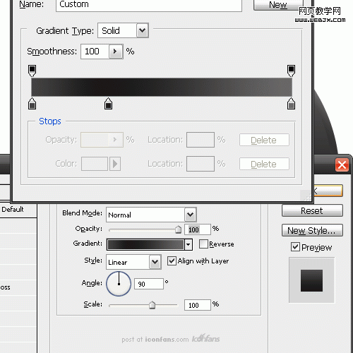
double click on the ‘circle’ layer to add a gradient overlay.
雙擊圓圈層添加漸變疊加效果

|||
there is nothing scientific here. just alternate between a very light grey to a dark grey. i used #333333 and #dadada. you can play around with these settings to get the look you want. you may even want to come back to this step after the logo is finished to tweak the look a little.
這里沒什么玄妙的。只是交替使用輕灰色和深灰色。我用的#333333和#dadada。你可以更改設置使其呈現你想要的效果。我們甚至可以再logo完成后再來更改。
第三步:
create a new layer and name it ‘circle top’. on this layer, use the same method that i described in step 1 and make another circle that is slightly smaller than the first one. this second circle should cover most of the one below.
建立新層命名“圓圈上部”。在這層里,用第一步的辦法建立比第一個園稍小的圓。第二個圓圈應該蓋住第一個圓圈的大部分。
give this circle a gradient. i used a lighter grey, #686868, that fades into a darker grey, #181818, then back to the lighter grey. use the settings in the example above. again, this is nothing that needs to be exact. you can play around with the settings to come up with the look you like.
給這層應用漸變疊加。我使用的淺灰色,#686868,淡化到深灰色,#181818.然后回到淺灰。使用上例中的設置。這里設置沒有什么是必須精確的。你可以自由設定。
第四步:

now to give this layer a bit of shine. control click the ‘circle top’ to add a marquee around the circle. create a new layer and call it ‘circle top shine’. select the elliptical marquee tool [m] then choose the ‘subtract from selection option. then, remove part of the marquee selection so it looks like the example above.
make sure you have the ‘circle top shine’ layer selected and grab the gradient tool [g]. modify the gradient so that is fades from white to transparent. fill the selection with the gradient so that it looks like the example above.
現在我們給這層添加一點高光。按住control再點擊”圓圈上部“層(載入選區)。建立新層命名為“圓圈上部發光”。選擇橢圓選擇工具【m】,選擇從選區減去。然后縮小選區使其看起來如上圖所示。
確認選中“圓圈上部發光”層,選擇漸變工具【g】。修改漸變為從白色到透明。如上圖填充選區。
|||
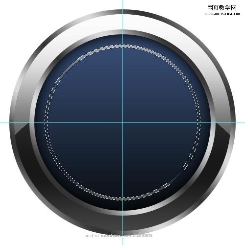
第五步:
create a new layer underneath the ‘circle’ layer and call it ‘background circle’. draw a circle with the elliptical tool . give it a gradient overlay that starts with a shade of blue and fades down to a darker shade of blue. i used the colors #394f78 and #0a0f14. i then gave the circle an inner glow. i changed the inner glow color to black and the blend mode from ‘screen’ to ‘normal’. adjust the settings until you like how it looks.
create a new layer above the ‘background circle’ layer and name it ‘background circle highlight’. with the marquee tool [m], select a circle with the same technique you used to make the first two circles. while holding [alt] and [shift] drag from the center to create the first circle. using ‘subtract from selection’ cut out the center to leave a thin selection.
using the gradient tool [g], choose white fading into transparency. drag down on the top half of the selection, then drag up from the bottom half of the selection. it should look like the example above. the deselect [ctrl + d] the circle and give it a gaussian blur of about 4.5 pixels.
在“圓圈”層下建立新層命名“背景圓圈”。用橢圓工具【u】畫圓。添加漸變疊加效果,漸變有藍色開始,淡入到深藍。我使用的#3947f78和#0a0f14。然后我使用了內發光效果。改變內發光顏色為黑色,混合模式有“濾色”改為“正常”。你可以自由改變設置。
在“背景圓圈”層上建立新層命名為“背景圓圈高光”。用選擇工具【m】,用前兩個圓圈的創建辦法創建圓形選區,將中心刪除,留下一個窄的圓環選區。
選擇漸變工具【g】,選擇白色到透明的漸變。在圓環上半部分從上到下拖到,下半部分由下往上拖動。應該看起來如上圖所示。取消選區,應用4.5px的高斯模糊。
第六步:
this is an easy step. create a new layer above the ‘background circle highlight’ layer. name it ‘background circle shine’. using the elliptical marquee tool [m] draw an oval shape towards the top the the background circle. use the gradient tool [g] with a white fading to transparency to fill in the circle. change the layer’s blending mode to ‘soft light’.
這一步很簡單。在“背景圓圈高光”層上面創建新層命名為“背景圓圈發光”。用橢圓選擇工具【m】,在背景圓圈上部畫一個橢圓。用漸變工具【g】,用白色到透明填充圓圈。
第七步:

finding the ‘w’ for the logo was a tough one. i ended up tracing it from an existing wordpress logo. you can get a vector version of the logo here. after tracing out the ‘w’, put it on a layer above the ‘background circle shine’ and name it ‘the w’. size it and place it so that the edges are just barely behind the circle layer above it.
要找到“w”這個字母還費了點周折。最后我從wordpress的logo力找到了一個現成的。你們可以從這里得到矢量圖形。找到"w"后,將他置于“背景圓圈發光”層上面并命名為w。改變大小和位置,使其邊界正好位于其上面的圓圈層的里側
right click on the very first layer you made, ‘circle’, and select ‘copy layer style’. then right click on the ‘the w’ layer and select ‘paste layer style’. it should now have the same gradient as the first circle layer.
右鍵點擊你建立的第一層“圓圈”選擇“復制圖層樣式”。然后右鍵點擊“w”層,選擇“粘貼圖層樣式”。它應該具有和第一個圓圈層一樣的漸變。
[ctrl] click the icon on the ‘the w’ layer to add a marquee around the w. go to select -> modify -> contract. choose 3 pixels. the marquee will then shrink by 3 pixels.
按住【ctrl】點擊“w”層的圖標載入選區。執行 選擇->修改->收縮。選擇3像素。選區就會縮小3像素
with the ‘the w’ layer still selected and with the shrunken marquee selection, click [ctrl + j]. this will copy the marquee selection and make a new layer out of it. name this new layer ‘the w top’.
w層和縮小后的選區為選中狀態,按【ctrl+j】,這會復制選區并在其基礎上建立新層。命名為”w上部“層。
double click on the ‘the w top’ layer to open up the layer effects dialog. give it a gradient the fades from a light grey at the top down to a darker grey. i used #ffffff and #000000 and moved the scale slider up to 150%. feel free to use your own method to create this look.
雙擊“w上部”層打開圖層樣式對話框。應用漸變,由頂部的淺灰到深灰。我使用的是 #ffffff 和 #000000(這明明是黑到白嘛。。。)。將縮放滑動條移到150%,可以用自己的辦法實現這個效果。
第八步:

ok, for the last step. we are going to repeat the same technique we used in step 4 to add a shine to the w. create a new layer above the ‘the w top’ layer and name it ‘the w top shine’. now, [ctrl] click the icon on the ‘the w top’ layer add a marquee selection. use the elliptical marquee tool [m] to deselect the bottom half. then, fill the selection with a white to transparent gradient.
好了,最后一步,我們將使用在第四步使用的技巧來給w添加高亮。在“w上部”層上面建立新層命名為“w上部發光”。現在按照【ctrl】點擊“w上部”層載入選區。用橢圓選擇工具將選區下部減去。然后給選區填充白色到透明的漸變。
最后效果:
as a final touch i added a drop shadow to the ‘circle’ layer.
you are done.
sit back, relax and bask in your awesomeness.
作為收尾工作,我給“圓圈”層添加了投影效果
新聞熱點


疑難解答